In this article, the author explains why AI/ML is not magic, even though some might think...

In March 2023, investment bank Goldman Sachs predicted in a report that Artificial Intelligence could eventually replace 300 million full-time jobs globally and affect nearly one-fifth of employment — with a particular hit to white-collar jobs often considered automation-proof, such as legal and finance professions. It makes many of us worry – are our FP&A jobs at risk? The good news is that human connection and providing good insight is a skill that differentiates humans from AI.
The Traditional View
Historically, there have been many compliance-based tasks to perform in finance, such as ground-up budgeting, ground-up forecasting, transaction-based financial reporting, and enforcing transaction-based expense controls. What I see as the good news is that we can use software and technology to help us become more efficient at these necessary tasks. More technology can give us more accurate data faster and even assist in sorting and filtering it. Automating repeatable tasks allows us to focus on value-oriented activities, such as strategic advising, resource allocations, capital structure, estimates and assumptions.
Can Data Speak for Itself?
As technology provides more real-time data, the question of how we provide insights and tell stories with the data becomes more important. Can AI help us get the story right? Maybe, but AI will really struggle to resolve human conflict over the interpretation of data.
Recently, we encountered a situation where we were working on a segment of the business outside our core operations. It means our standard reports were less useful, and we had to exercise some creativity in providing relevant data. One of my colleagues ran the standard report’s data that she felt was self-explanatory to her Business Partners. Did they draw the conclusions that she thought were obvious to them? No, they did not. Why? I believe they were looking for data supporting their preconceived ideas. Stakeholders may reject information that does not support preconceived ideas. Maybe this is a problem for AI, so I decided to ask ChatGPT if the data can speak for itself. The good news: AI agreed with me – data don't speak for itself.
"The phrase "data speaks for itself" is often used to suggest that objective facts and evidence should be sufficient to support a conclusion or argument without the need for additional interpretation or explanation. However, it's important to note that data, in and of itself, does not possess the ability to communicate or convey meaning independently.
Data is a collection of raw, unprocessed facts or observations. It lacks context, interpretation, and subjective understanding. It requires human interpretation and analysis to extract meaning, draw conclusions, and make informed decisions based on the data.The interpretation of data involves considering its relevance, reliability, and potential biases. Data analysis often involves applying statistical methods, visualisations, and domain expertise to make sense of the information contained within the data. This process requires human judgment, critical thinking, and an understanding of the broader context in which the data is situated.
While data can provide valuable insights and evidence to support or challenge claims or arguments, it cannot fully replace human analysis and interpretation. It is the responsibility of individuals to examine and interpret the data in order to communicate its significance effectively."
Simpson's Paradox
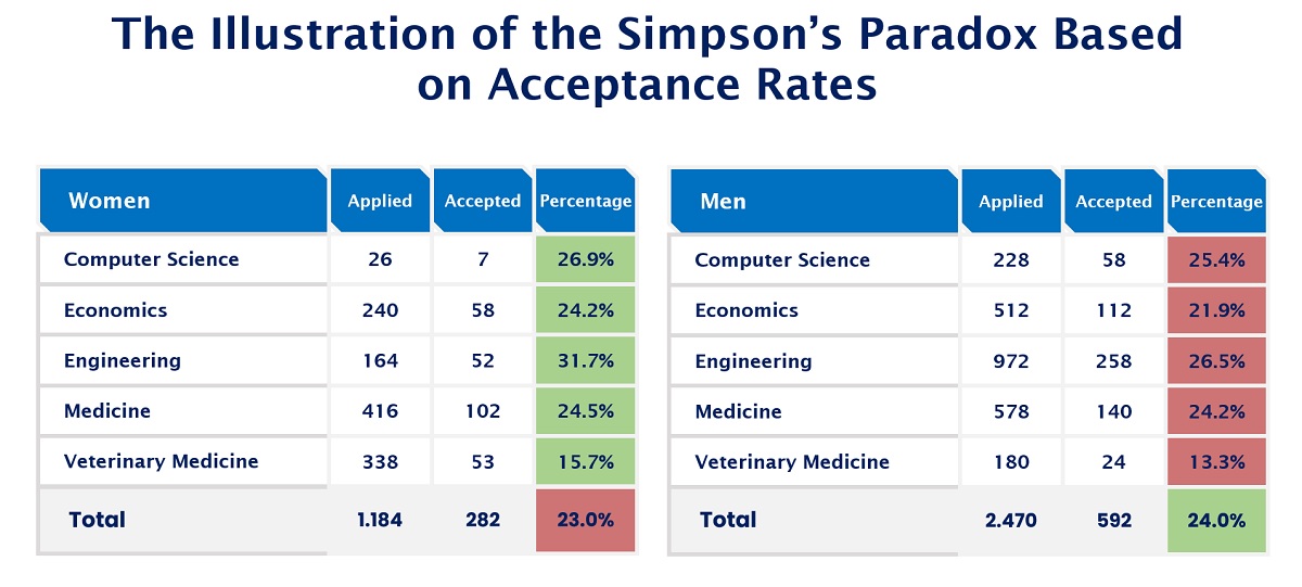
I thought this problem could be a result of Simpson's paradox. Simpson's paradox is a statistical phenomenon in which a trend or relationship between different groups reverses or disappears when the groups are combined or aggregated. It occurs when a confounding variable affects the relationship between two variables, leading to a misleading or contradictory conclusion. There is an example below where the college acceptance rates for women at 23% are lower than those for men at 24%. However, each subject has a higher acceptance rate for women than men. The traditional view of the financial analyst is that we need to show all the data to our audience and let the end user interpret the conflicts within the data. However, in this case, we have to ask ourselves if all the data can be helpful when it has a confusing message, as presented below.

Figure 1
I decided to ask ChatGPT how to present issues with Simpson's paradox. Here's the response I received:
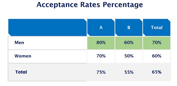
To demonstrate Simpson's paradox, I can provide you with a simplified numerical example. Let's consider the admission rates of two departments, A and B, for two different groups, Males and Females:
Department A:
- Male Applicants: 80% admitted (80 out of 100)
- Female Applicants: 70% admitted (70 out of 100)
Department B:
- Male Applicants: 60% admitted (120 out of 200)
- Female Applicants: 50% admitted (100 out of 200)
If we consider each department individually, it appears that Department A has a higher admission rate for both males and females. However, when we combine the departments and analyse the data as a whole, we see a different picture:Combined:
- Male Applicants: 140 out of 300 admitted (46.7%)
- Female Applicants: 170 out of 300 admitted (56.7%)
After some examination, I noticed that ChatGPT makes math mistakes just like humans. So, I asked how can 80+120=140. Doesn't it equal 200? And I received a nice apology!
Apologies for the error in the previous response. You are correct; the numbers provided were incorrect. Here's the corrected example to demonstrate the Simpson's paradox:
Department A:
- Male Applicants: 80% admitted (80 out of 100)
- Female Applicants: 70% admitted (70 out of 100)
Department B:
- Male Applicants: 60% admitted (60 out of 100)
- Female Applicants: 50% admitted (50 out of 100)
Combined:
- Male Applicants: 140 out of 200 admitted (60.0%)
- Female Applicants: 120 out of 200 admitted (40.0%)
ChatGPT corrected its math, but the insight was still wrong. There is no Simpson's paradox if the percentage of men's acceptance rates is higher than women's in all scenarios.

Figure 2
Presenting It Differently to Provide Insight and Drive Actions
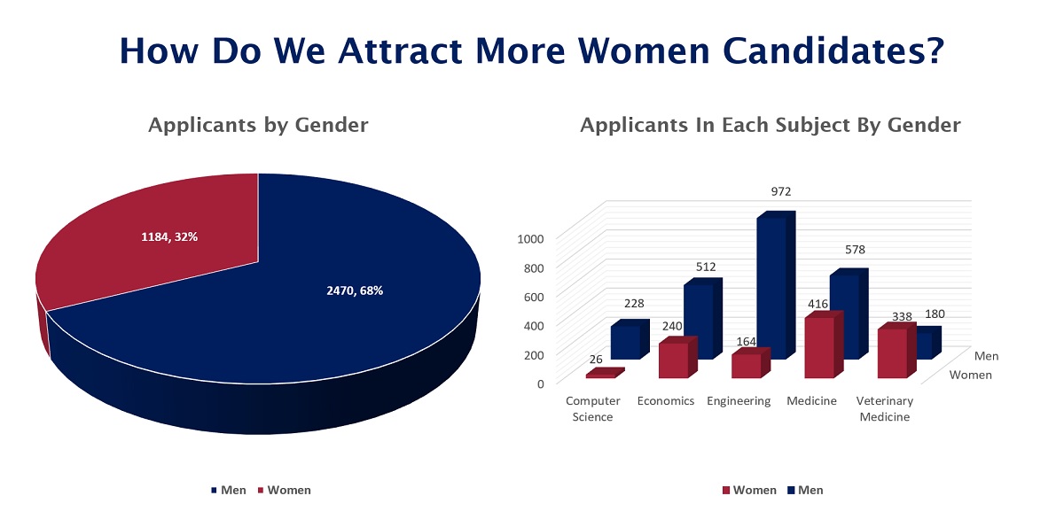
What is much more helpful than providing all the data is presenting the relevant data to the problem at hand. For example, how do we get more women interested in applying? Only 32.4% of applicants are women compared to 67.6% of the population being men. Additionally, what can we do to get more women applying to engineering, as only 13.8% of females are applying for this specialisation? Why are 65.2% of the candidates in veterinary medicine women, while only 34.8% are men? It’s the only program with more women candidates than men.
What I like about this is how we are flipping to a growth mindset as opposed to how we measure precisely. We also inspire more curiosity by asking why the data is the way it is instead of presenting it as factual. Do we attract more women than men because of our marketing strategy? Or is it an innate difference between men and women or something in our culture? The additional truth is that there is noise within all data sets. Is that data fairly consistent year to year, or was the year we reviewed an outlier in data? Here is the same data, presented in a way we would find useful towards addressing how we get more equality in a number of individuals between women and men.

Figure 3
Conclusion
While Artificial Intelligence and software can help us access more data and help us become more efficient in preparing reports, they still do not allow us to identify the focal points and how we should present the data to drive impact. Filtering the information to provide it to our end users in a way they can easily identify and interpret is a skill that FP&A professionals should develop to increase our influence.
Subscribe to
FP&A Trends Digest

We will regularly update you on the latest trends and developments in FP&A. Take the opportunity to have articles written by finance thought leaders delivered directly to your inbox; watch compelling webinars; connect with like-minded professionals; and become a part of our global community.


