In this article, discover how FP&A storytelling turns numbers into compelling business stories using waterfall charts to engage stakeholders and

Are your charts telling a story or just showing numbers? Jürgen Faisst, Author, Speaker, and Managing Partner at IBCS Institute
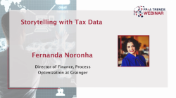
In this video, Fernanda Noronha, Director of Finance at Grainger, shares how she bridged the gap between tax and finance

In this article, the author explains three key strategies for fostering a data-driven culture in your organisation: data literacy training

This article explores frameworks for developing FP&A dashboards and tells us how FP&A professionals can design informative and insightful dashboards

In this article, the author compares data visualisation to healthy nutrition, underscoring the importance of the essential components for making
Pagination
Subscribe to
FP&A Trends Digest

We will regularly update you on the latest trends and developments in FP&A. Take the opportunity to have articles written by finance thought leaders delivered directly to your inbox; watch compelling webinars; connect with like-minded professionals; and become a part of our global community.


