
This article explores frameworks for developing FP&A dashboards and tells us how FP&A professionals can design...

Beyond the Numbers: How Data Visualisation Drives Strategic Decisions
November 15, 2024
Can data tell a story? What challenges do finance teams face when translating complex data for decision-makers? And how can data visualisation go beyond numbers to support strategic actions? These are the questions that today’s finance professionals must answer as they work to make data insights clear, relevant, and actionable for their organisations.
This article summarises the FP&A Trends webinar “Leveraging Data Visualisation: Empowering Strategic FP&A Decisions” and explores how industry experts Fernanda Noronha, Jürgen Faisst, and Liran Edelist use data storytelling to bridge the gap between just visualising data and supporting strategic decisions.
Storytelling with Tax Data
Fernanda Noronha, Director of Finance, Process Optimisation at Grainger, transitioned to leading global tax provisions in 2018 for a major multinational corporation. This role required her to bridge the gap between tax and finance, presenting complex tax data in a manner that could be understood across the company. Her challenges included:
- the material impact of corporate tax on financial statements,
- translating the specific language of taxation for a broader finance audience,
- adapting to the shifting tax landscape following the 2017 US tax reform,
- and reducing volatility in tax forecasts.
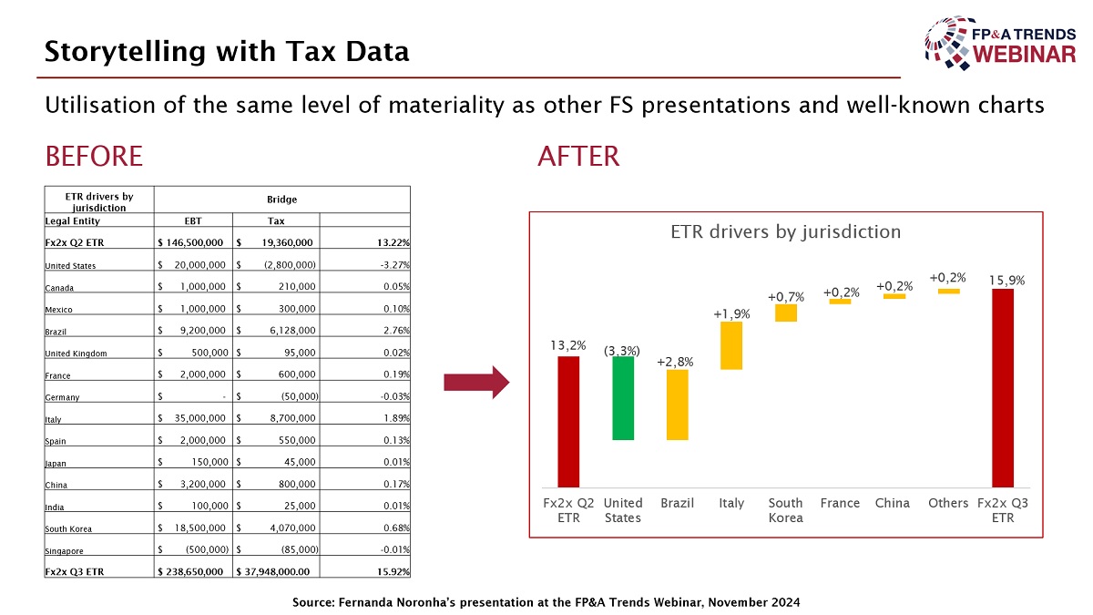
Figure 1
To address these challenges, Fernanda integrated the tax team with Financial Planning and Analysis (FP&A), enabling her team to adopt similar communication styles. This involved using visuals like waterfall charts, rounding figures consistently, and categorising data for clarity. They aligned their methods with the broader finance teams, presenting data horizontally and using distinctive colours to highlight financial impacts. Through improved visualisation and alignment, Fernanda’s team made tax data more accessible and transparent, ensuring clearer communication with senior management and auditors while fostering better understanding across departments. This approach ultimately strengthened the company’s tax reporting and forecasting.
What Is the Biggest Challenge in Data Visualisation?
The poll revealed that the biggest challenge in data visualisation is to communicate clear messages through visuals, as identified by 40% of respondents. Following this, 33% highlighted a lack of skills in Business Intelligence and visualisation tools as a significant hurdle. Designing insightful dashboards was cited by 16% of participants while creating engaging visuals ranked as the least challenging area with only 11% of respondents.
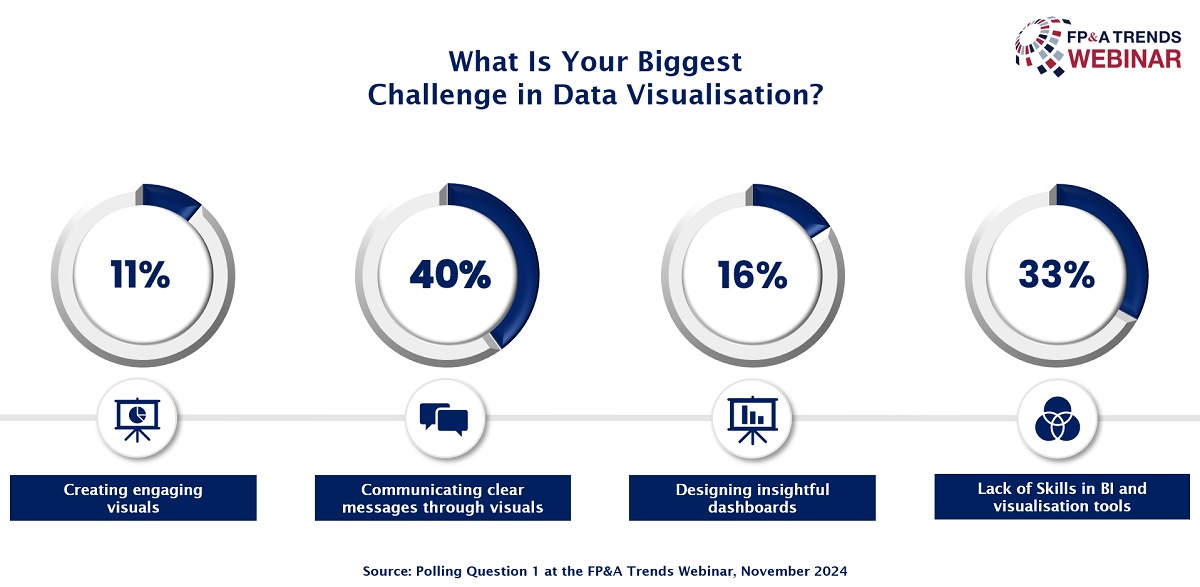
Figure 2
Visualise Stories, Not Data, to Empower Strategic Decisions
Jürgen Faisst, Author, Speaker, Managing Partner at IBCS Institute, emphasised in his presentation the importance of storytelling over merely visualising data. Using the IBCS methodology, he trains finance professionals to transform raw data into narratives that resonate with decision-makers. Jürgen shared an exercise from his workshops where participants initially struggled with visualising a balance sheet by defaulting to tables and data. He guided them to focus instead on insights such as financial stability and return on equity, prompting more meaningful visualisation approaches.
Jürgen illustrated his point with an example from PepsiCo’s annual report, where pie charts failed to convey an increase in healthier product sales effectively. He proposed an alternative using stacked and normalised column charts to show both absolute and relative growth, aligning better with the report’s message. Jürgen argued that data visualisation should go beyond observation, as it should provide explanations and actionable insights to support strategic decisions. His presentation highlighted that effective data storytelling requires not just showing trends but also encouraging thoughtful recommendations and future actions.
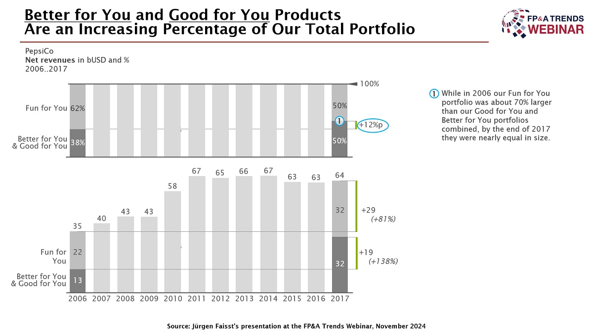
Figure 3
How Many Management Reports Focus on a Suggestion as Their Key Message?
The poll results revealed that 54% of respondents state that only 25% of management reports in their organisations focus on a suggestion as the key message. Another 24% indicated this figure is closer to 50%, while 15% admitted that none of their reports emphasise suggestions. Only a small percentage (6%) claimed that as much as 75% of their reports include a key message focused on actionable recommendations. These findings highlight a general gap in management reports prioritising suggestions and strategic insights.
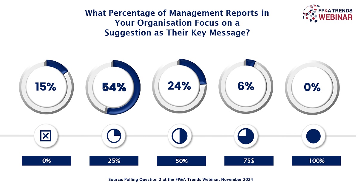
Figure 4
Three Pillars of Effective Data Visualisation
Liran Edelist, PhD, Chief Product Officer, Enterprise Planning at Lumel Technologies, highlighted three pillars of effective data visualisation: reporting, storytelling, and self-service. Reporting includes various types, from standard to ad-hoc reports, which evolve into Key Performance Indicators (KPIs) and forecasting tools that provide deeper insights. Liran emphasised that advanced reports should move beyond "what happened" to address "how to fix" issues, which adds business value.

Figure 5
In storytelling, he stressed using visuals to tell clear narratives, incorporating notes directly into charts to convey context. For self-service, Liran explained that accessible tools empower business users to generate and customise reports independently, reducing reliance on technical support. Despite these advancements, he noted gaps in collaboration, where users still question data or find information fragmented across sources. To address this, Liran proposed integrating collaboration directly into the data platform, allowing users to ask questions, make updates, and approve data within the visualisation environment itself. This approach enhances decision-making by aligning reporting, storytelling, and self-service in a single, cohesive platform, maximising the value of data-driven investments.
Conclusions
Effective data visualisation and storytelling depend on a clear understanding of the audience’s business questions and decision-making needs. By focusing on conveying relevant insights rather than merely presenting data, professionals can transform complex information into actionable narratives that empower strategic decisions.
Successful data storytelling should be intuitive, tailored, and aligned with key business objectives, helping audiences connect with the message and make informed choices. Ultimately, meaningful visualisations that prioritise clarity and purpose not only enhance comprehension but also foster collaboration and drive value across the organisation.
To watch the full webinar recording, please check out this link.
We are grateful to Lumel Technologies for sponsoring this webinar.
The full text is available for registered users. Please register to view the rest of the article.
Related articles

In this article, the author compares data visualisation to healthy nutrition, underscoring the importance of the...

In this article, the author shares the essentials of compelling data storytelling and provides several tips...

In this video, Ivan Mitringa, Worldwide CFO Displays, Software & Client Peripherals at Dell, explains...

Data storytelling is a growing trend that is picking pace with each passing day. In his...

Jürgen Faisst speaks about the role of dashboards in storytelling. He highlights that while dashboards can be...
+
Subscribe to
FP&A Trends Digest
We will regularly update you on the latest trends and developments in FP&A. Take the opportunity to have articles written by finance thought leaders delivered directly to your inbox; watch compelling webinars; connect with like-minded professionals; and become a part of our global community.