
The role of the finance leader is changing. Before long, your colleagues may see you more...

Top Three Mistakes in FP&A Data Visualisation to Stop Making Today
June 23, 2021
 What is your data literacy level? Everybody agrees data visualisation is powerful. When you get ready to prepare your month-end close reporting, you realise:
- You don't have time to think of the visual presentation.
- You get lost in tons of styling functionalities.
Then you go for templates from the web or take default options set up in your Excel or any other BI tool. Very often, default options are not the visual best practices.
This article will guide you through the most common and not-so-obvious data visualisation mistakes. Since cognitive psychology is the main factor responsible for how we perceive, decode and remember information, in this article, I will share the science-backed evidence of why these three mistakes are crucial and how FP&A professionals can improve their data visualisation skills.
1. Keeping pie charts in your favourites
Circles are tempting. By nature, we love circular objects. Infinity, unity, symmetry and purity are attributes of beauty. Most of them we associate with circles, so pie charts and doughnut charts seem to be perfect.
Why should you avoid pie charts?
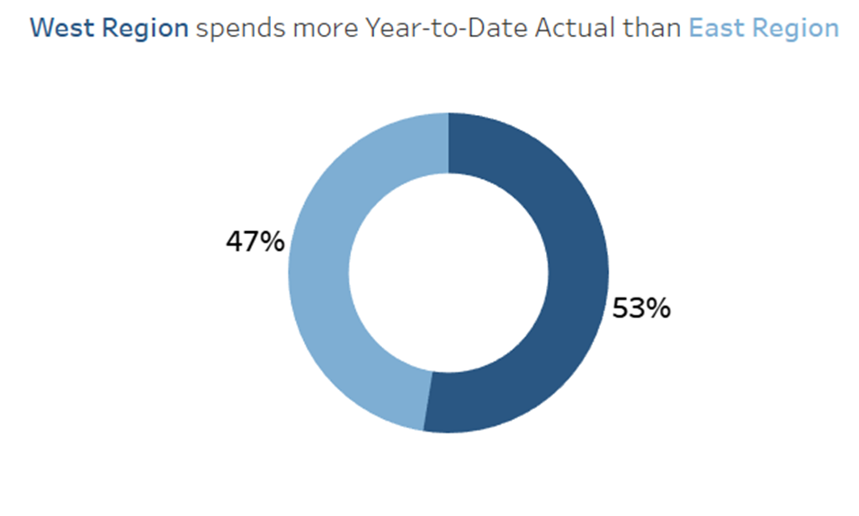
It is hard to read numbers accurately from the pie chart. The human brain does not perceive easily 2D shapes. In other words, we find it difficult to estimate which area is bigger. See for yourself! Guess the percentage values of these graphs:
How accurate was your guess? According to one of the studies, most people fail this experiment. It’s a piece of ultimate evidence that pie charts are not the best data visualisation graph choice as we talk about FP&A. Even though you put numbers next to the pies, it takes a bit of time to skim the results. Your attention goes to reading figures instead of comparing the size of the pie parts. Data visualisation must visualise numbers. If your eyes focus on reading the numbers, that means that the chart is as effective as a text table. Your goal is to provide insights quickly, accurately and efficiently to digest. Pie charts, including many categories, are inappropriate for reporting. If you agree with this statement, remove the pie chart from your report right now.
How can you replace pie charts?
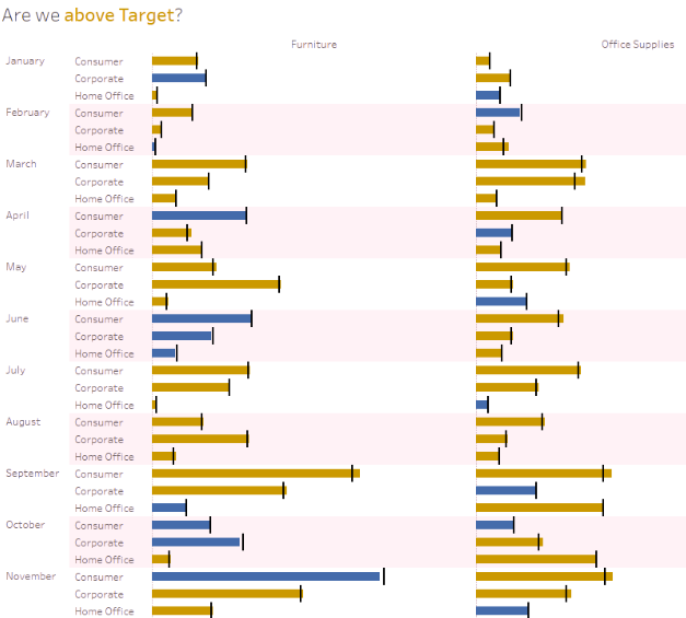
However, the human brain deals incredibly well with one-dimensional shapes like lines, where we decode only the length of the object. See the same data as a bar chart:
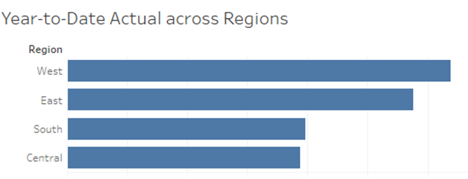
Notice, how easily and quickly you see the distribution across regions and proceed with comparison. After looking a second, you might conclude West and East regions spend much more than the South and Central. Also, you might say South spends a bit more than Central. In the above pie chart, it would be impossible to find out this insight.
Of course, there’s one situation when pie charts are yummy and friendly graphs in the business.
When can you use pie charts?
Use pie charts when you present only two categories with each other. When you have more than two categories, choose a different type of data visualisation. Length is the most effective visual attribute for data accuracy. The length makes it easy:
- comparing slight differences
- sorting the data points
- perceiving proportions
2. Showing green and red colours on the same page
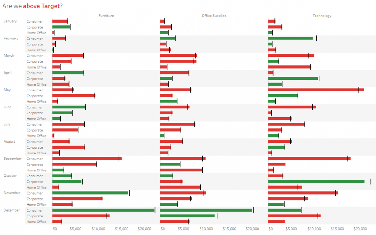
Did we exceed the target or not? The typical FP&A use case is to depict the data in green and red, indicating good or bad signs. Such a simple choice like the right colour might disrupt the accessibility of the information to everyone.
Why should you avoid this?
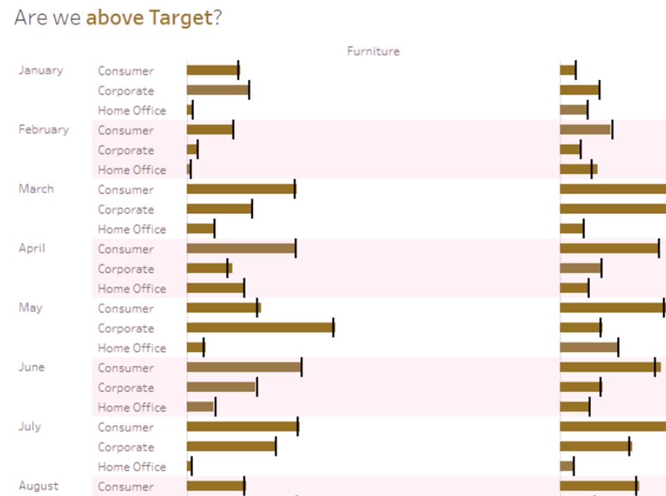
According to an NIH study from 2016, 10% of men and 0.5% of women cannot differentiate between green and red. By uploading the above graph to the Color-Blindness.com website, we can see how colour-blind colleagues see this data visualisation:
How can you solve this issue?
Test your colour palette whether it is colour-blindness friendly. Save your custom palette to shorten your colour choice when you prepare your next FP&A presentation. Download Color Oracle or go to Color-Blindness.com to validate the colours in your graphs. The perfect combination of colour blind friendly colours are:
- Blue and orange
- Blue and red
- Dark blue and bright green
These colours are key to the accessibility of the same data to everyone. Let’s simulate the perspective of the same colour-blind person once the report is blue and orange. The results are excellent!
3. A decorative picture in the upper left corner
Why does it matter?
This corner is super essential for you! In European culture, you read from left to right in the Z-pattern. Skimming the page goes in F-shape.
People lose attention a couple of seconds after interacting with a presentation or report. You miss crucial seconds of concentration for looking at things such as a company logo or a decorative pane. Instead, your goal is to give asap the answers on:
- What data do I look at?
- How are we performing now vs the previous period?
- Have we reached the target?
- What are the key drivers this month?
We look most intensively in the upper left corner, and we remember best this information.
An eye-tracking study from Tableau Software shows a piece of evidence that users focus their attention in the upper left corner and skim the page in the F-pattern.
Source: Tableau Software
What's more, the way of skimming the page changes when you add vivid, attention-driving colours. The red colour attracts attention the same way as a human silhouette. That's why I recommend using red and vivid colours consciously, only when you intend to warn your audience with the message.
Source: Tableau Software
How can FP&A leverage the upper left corner?
Notation and standardisation are crucial in FP&A reporting. The data-driven metrics need a proper explanation to get out their value of them quickly. Instead of decorative pictures, put a meaningful title for the presentation. In a subtitle, explain what kind of data you present: spend category, currency conversion, forecast version etc.
Then, put there the most important strategic KPI or visualisation in the upper left corner.
Conclusion
You don't need a diploma in graphic design. It is a matter of little tweaks that skyrocket your FP&A storytelling and FP&A presentation skills.
Data visualisation must engage your audience. Make the FP&A story memorable by choosing the right chart. Communicate numbers accurately. Everyone must interpret the definition of the data points the same way.
They're more than 3 data visualisation mistakes I encounter every day. However, improving these three areas will give you a giant leap into data literacy. To recap, here are three tips to keep best practices in FP&A data visualisation:
- Choose bar charts over pie charts.
- Use colour-blind-friendly colours (e.g. blue and orange).
- Put the top priority message in the upper left corner.
The full text is available for registered users. Please register to view the rest of the article.
Related articles

Now, more than ever, the FP&A profession stands to propel itself forward as the premier business...

On the 9th of March, Larysa Melnychuk hosted an inspiring webinar about FP&A Data Visualization: Moving...

Knowing your numbers is a good starting point for an FP&A professional. But it is also...

University of Pennsylvania researchers report that the human retina processes data at approximately 10 million bits...
The purpose of Financial Planning and Analysis is not to build perfect forecasts and financial solutions...
+
Subscribe to
FP&A Trends Digest
We will regularly update you on the latest trends and developments in FP&A. Take the opportunity to have articles written by finance thought leaders delivered directly to your inbox; watch compelling webinars; connect with like-minded professionals; and become a part of our global community.
jfcorona
June 24, 2021
Lindaxu
June 25, 2021
duncanwil
July 6, 2021