
Well-designed incentive compensation plans – especially sales commission plans – are an incredibly powerful way to...

FP&A Data Visualisation: Moving from Insight to Impact
April 8, 2021
On the 9th of March, Larysa Melnychuk hosted an inspiring webinar about FP&A Data Visualization: Moving from Insight to Impact where three senior professionals focused on discussing three pillars of FP&A storytelling:

This article explains what is behind these components:
Consistent notation
Data visualization
Sustainable technology
Data visualization: what it is and its benefits
Professor Hans Rosling, a great statistician and data visualization popularizer, compares data analytics to music.
“Most of us need to listen to the music to understand how beautiful it is. But often that’s how we present statistics: we just show the notes, we don’t play the music”.
The power of data visualization is the ease to digest the large dataset quickly. In a couple of seconds, you can grasp complex information. That allows you to make better-informed decisions.
Stephen Few, a thought leader in information design, says data visualization is a way to shape effective presentation.
“To find signals in data, we must learn to reduce the noise – not just the noise that resides in the data, but also the noise that resides in us”.
Science proves the benefits of visual analytics. Applying IBSC-compliant reporting and data-rich presentations guarantee higher data literacy in your organization. A laboratory study with the Technical University of Munich proves the benefits of IBCS. 61% fewer errors in reading reports and 46% faster in decoding the data.
Consistent notation in FP&A
Jürgen Faisst, a Managing Partner at IBCS Institute, clarified why CFOs don’t like colourful data visualization and shared a couple of recommendations on how to make business communication more effective:
Reduce the noise and number of colours. Effective dashboard implementation needs a consistent style guide. Standardization is a way to make data analytics digestible: the fewer colours you have, the easier it is for the audience to focus on the key message.
Keep consistent business communication. Every expertise has its communication system to make work easier on the international level. Take a look at engineering sketches, music notes, road signs and even FP&A reporting with IBCS. A consistent method to present variances, actual, forecast and plan data reduces your time decoding the information and you spend more time taking actions.
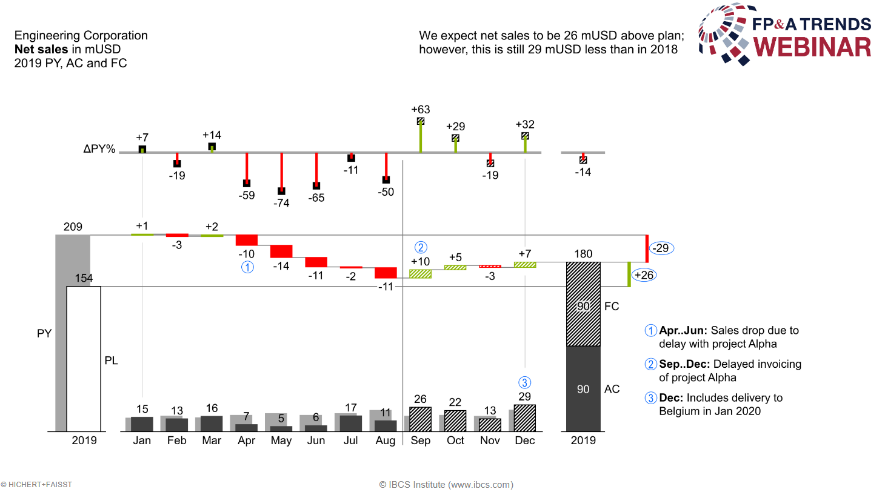
Follow the IBCS recommendations. They include first, unification of the titles, second, highlighting variances with green and red colour, third, using a consistent colour and fill patterns. This makes it easier to read the graphs (see an example below).
During the webinar, hundreds of attendees from the FP&A industry took part in the poll and described the current state of their reports and dashboards. Only 2% has already implemented IBCS-compliant reports. 54% see potential in establishing a consistent data presentation. There are still areas of improvement, and the FP&A industry is on an excellent way to achieve it.

FP&A Data Visualization
After defining standard notation to your reports, you can jump to the next level. The narrative in data visualization moves you to data storytelling in FP&A. Ron Monteiro, Corporate (Senior) Director of Finance at Kruger Products L.P., explained best practices in FP&A dashboarding.
There are three effective data visualization considerations for FP&A:
Understand & cater to your audience
Create visuals that deliver a quick understanding
Visuals help initiate actions to capitalize on opportunities and risks
What can FP&A do to tie in visualization and storytelling?
1. Understand the data. Storytelling will always be a critical skill for FP&A. Data is hard evidence that covers current business scenarios. It is up to you what dataset you find the most insightful to FP&A leaders. As an FP&A storyteller, you enable a quick understanding of the business issues and call to action (CTA).
2. Develop the key message. Effective data presentation happens when you are empathetic to your audience. Always think of the audience first. Formulate the story in your mind. If you have a significant variance in variable cost, it is worth adding an explanatory chart to answer the why question. Answer essential questions to develop the key message:
What is the purpose of my story?
Who is the target audience?
Why do I need to open this finance report?
What is the call to action?
What risks or opportunities do I want to convey?
3. Select the right charts. Visuals support the storyline. Proper graphs, charts, and comments are tools for the audience to tell a story with data quickly.
Technology for FP&A data visualization
74% of webinar attendees admit they present FP&A data in Excel or PowerPoint. Surprisingly only 21% use BI tools. It is a massive opportunity in the FP&A industry to move into smart solutions that enable collaboration and storytelling.

Michael Lengenfelder, Vice President Application Design at Unit4, told the audience how technology puts FP&A reports to the next level. Michael shared a set of data visualizations that suit IBCS. The key characteristic of a successful tool is the integration of all necessary collaboration and data presentation features in one application.
Conclusions
The webinar speakers shared some advice with the FP&A Trends community. It is important to get familiar with reporting standards. Firstly, find out what standards work well for your business case. Do you need to speed up processes? Do you want to improve communication? Learn how to adapt it.
FP&A professionals should also communicate findings. Become an FP&A storyteller based on your data and find the right level of detail for your planning.
Finally, find sustainable software to enable FP&A storytelling and support collaboration.
We would like to thank our global sponsor Unit4 for great support with this FP&A Trends Webinar.
To watch the full webinar recording, please check out this link.
The full text is available for registered users. Please register to view the rest of the article.
Related articles

When the graph is the right way to present your FP&A information, several important questions should...

There are so many ways to graph information, and many of them are not just labor-intensive...

University of Pennsylvania researchers report that the human retina processes data at approximately 10 million bits...

Dashboards have become a powerful tool for FP&A to share insight and gain respect. In this...
+
Subscribe to
FP&A Trends Digest
We will regularly update you on the latest trends and developments in FP&A. Take the opportunity to have articles written by finance thought leaders delivered directly to your inbox; watch compelling webinars; connect with like-minded professionals; and become a part of our global community.