
“A good sketch is better than a long speech…” a quote often attributed to...

Improving Communication With Data Visualisations
June 18, 2019
 The human retina can transmit data to the brain about 60,000 times faster than simple text! On top of processing visuals faster, people retain visual information at more than three times the rate of text alone. The speed with which we process visual data is important, not just for expediency, but because we deal with increasingly large volumes of data; we need to be able to communicate a lot with a little. These are just some of the reasons organisations increasingly use data visualisations to make better decisions to drive business performance.
A Simple Definition
Many view data visualisation as just a recent term for what has long been known as visual communication. But, data visualisation is not just a new buzzword; it is an entire field of study. Some universities worldwide offer degrees, some even master's degrees, in data science with an emphasis on data visualisation. It's not a new concept, just new terminology. Data visualisation is particularly relevant for finance and accounting professionals who frequently communicate numeric information. For clarity, let's look at a simple definition so that we are all on the same page when we talk about data visualisation. Data visualisation is simply the graphic representation of quantitative information.
Show, Don’t Tell
The old “a picture is worth a thousand words” concept really comes in handy when you have to make a point that could take much longer without visuals. Let's look at a simple example - a very simple shape like a square. Suppose we were to try to convey the idea of a square to someone using only text, we might say. In that case, a square is a four-sided flat shape with straight sides, a regular quadrilateral, with four equal sides and four equal angles, where every interior angle is a right angle (90°). Whew! What a mouthful. While that might be a perfectly fine, accurate description of a square, wouldn't a visual image of a square be a much more efficient way to get the point across?

Figure 1: An illustrative depiction of a square
Not only is the visual image of a square quicker and easier to understand, but you can see that it is a square from across the room, which you could not do with the text. Think about that impact if you're developing a dashboard to communicate lots of information. How valuable is it for your end users to be able to understand something in an instant?
Spot Things We Otherwise Couldn't/Wouldn't
Visual imagery helps us identify relationships more easily. Whether it’s the parts of a whole, like in a puzzle or a connection that is easy to see but hard to discern using logic, visuals sometimes make relationships clearer.
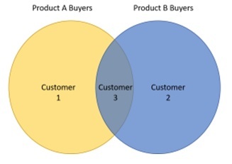
Figure 2: An illustrative depiction of customer relations
Kurt Koffka said of visual imagery,
“The whole is other than the sum of the parts.”
Koffka is one of the psychologists who developed the Gestalt principles of visual perception, which include a handful of principles of visual perception. Simply put, data visualisation helps us make more of data than merely the sum of its parts.
Many organisations worldwide have jumped in with both feet using data visualisation. Some of the biggest players in a wide variety of industries have been using data visualisation tools for years, including Audi AG, Bank of America, Barclays, Citigroup, ConocoPhillips, and Exxon Mobil, to name just a few.
Visualisations Can Be Interactive
While finance and accounting professionals frequently communicate numeric data, they are not the only ones using data visualisations. Many professions use them. Some of the visualisations I've run across were created by marketers to illustrate some novel and dynamic uses of data visualisation tools. Here is the one you might like that makes use of interactive visualisations:
These visualisations were created to create engagement and are good examples for anyone wanting to get users of their communications more involved and engaged. No matter your audience, getting them engaged with the data boosts understanding and retention and leads people to take more action.
If you communicate data at all, it is worth investing some time to explore data visualisation. A wide variety of tools are available to make creating visualisations easier than ever before. With a modest investment of time, you can try different options, come up with your wish list of functionality and narrow the field. Before you know it, you'll create visuals that take how you communicate information to a new level.
This article was first published in Unit4/Prevero Blog.
The full text is available for registered users. Please register to view the rest of the article.
Related articles
They say a picture is worth a thousand words… “Telling the story” is one of the...

To paraphrase the concept of Occam's razor, simpler explanations are generally better than more complex explanations...

University of Pennsylvania researchers report that the human retina processes data at approximately 10 million bits...

What is your data literacy level? Everybody agrees data visualisation is powerful. This article will guide...
Today’s world is characterized by information overload and attention deficit. The amount of data being created...
+
Subscribe to
FP&A Trends Digest
We will regularly update you on the latest trends and developments in FP&A. Take the opportunity to have articles written by finance thought leaders delivered directly to your inbox; watch compelling webinars; connect with like-minded professionals; and become a part of our global community.