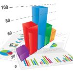
They say a picture is worth a thousand words… “Telling the story” is one of the...
 “A good sketch is better than a long speech…” a quote often attributed to Napoleon Bonaparte.
Companies are collecting, organising, storing, and analysing data from hundreds of sources, and the volume is increasing exponentially. But this data is only relevant if it can be used to drive outcomes and make timely business decisions. So it is essential to you can understand and evaluate the data quickly, and this is where data visualisation comes in.
The concept of using pictures to understand difficult data dates back to the invention of the pie chart in the early 1800s. Because of the way the human brain processes information, using a visual representation of data is much easier than trying to make sense of long lists of numbers in a spreadsheet.
With modern computer technology, data visualisation is becoming easier. “Data visualisation is going to change the way our analysts work with data,” Head of Customer Value Modelling for a UK bank, “They’re going to be expected to respond to issues more rapidly. And they’ll need to be able to dig for more insights – look at data differently, more imaginatively. Data visualisation will promote that creative data exploration.”
Visualisation tools in data analytics help your decision makers understand and interpret huge amounts of data, gaining useful insights that directly impact on business direction and strategy. Businesses can respond dynamically to changing market conditions and plan accordingly.
By utilising an advanced analytics system, the constant supply of data coming into your business is presented as easy-to-read visuals, either in graphical or pictorial format. This allows your team members to identify trends and patterns, which will influence and improve the decision-making process.
The top 5 benefits of data visualisation are:
- Efficiency – allow vast quantities of data to be absorbed quickly
- Insight – generate more understanding into the nature of the data – far better than numbers and tables
- Alignment – help create shared understanding of the position and actions required
- Accuracy – simply determine if data is complete and valid
- Speed – 28% more likely to find timely information than traditional reporting methods
So, how are visual representations of data going to affect your decision-making processes?
Subscribe to
FP&A Trends Digest

We will regularly update you on the latest trends and developments in FP&A. Take the opportunity to have articles written by finance thought leaders delivered directly to your inbox; watch compelling webinars; connect with like-minded professionals; and become a part of our global community.


