For FP&A, effective communication centres on 'storytelling' — the art of conveying numerical analysis as a...
 Data Storytelling is a discipline at the intersection of data analytics, psychology, and design. It allows you to convey data insights in the form of a compelling visual story. This short article explains why we need data storytelling, how to do it, and what we can expect at the end.
Why do we need Data Storytelling?
Although the term "Data Storytelling" is being used more and more often, to the point that it has become a buzzword, many of us are still wondering why we need data storytelling at all. Why can't we share our financial information without wrapping it up with some kind of story?
The answer to this question is hidden in our evolution. The fact is that our brains haven’t got a software update for the past 10 000 years. So, we are hunter-gatherers living in the age of data and data insights.
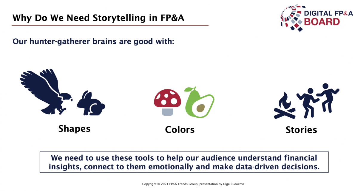
Indeed, we have some pretty old software in there, but it's not that bad. Our hunter-gatherer brains are very good at recognising shapes to distinguish predator from prey. We are very good at recognising colours to distinguish edible from poisonous. And we are very good at telling and listening to stories as a primary way of sharing information and a source of wisdom. (Figure 1)

Figure 1
Numbers, tables, and financial statements are not on that list, as we are not naturally good with those. To communicate these types of information in an understandable and memorable way, we need to use what we have at our disposal.
How can we use stories, shapes and colours to help our audience understand financial information, connect emotionally to it and use it to make data-driven decisions?
How to do FP&A Storytelling
Many of us, who have realised the importance of Data Storytelling, are still overwhelmed by its perceived complexity. It seems like a completely new craft, we need to learn from scratch.
It is certainly true that we were not taught data storytelling at college or university, but it is hardly something entirely new to us. We are all born storytellers.
YOU ARE A STORYTELLER ALREADY!
That is exactly the main reason, we turn to storytelling as a form of communicating complex data insights – it is natural and understandable for all of us.
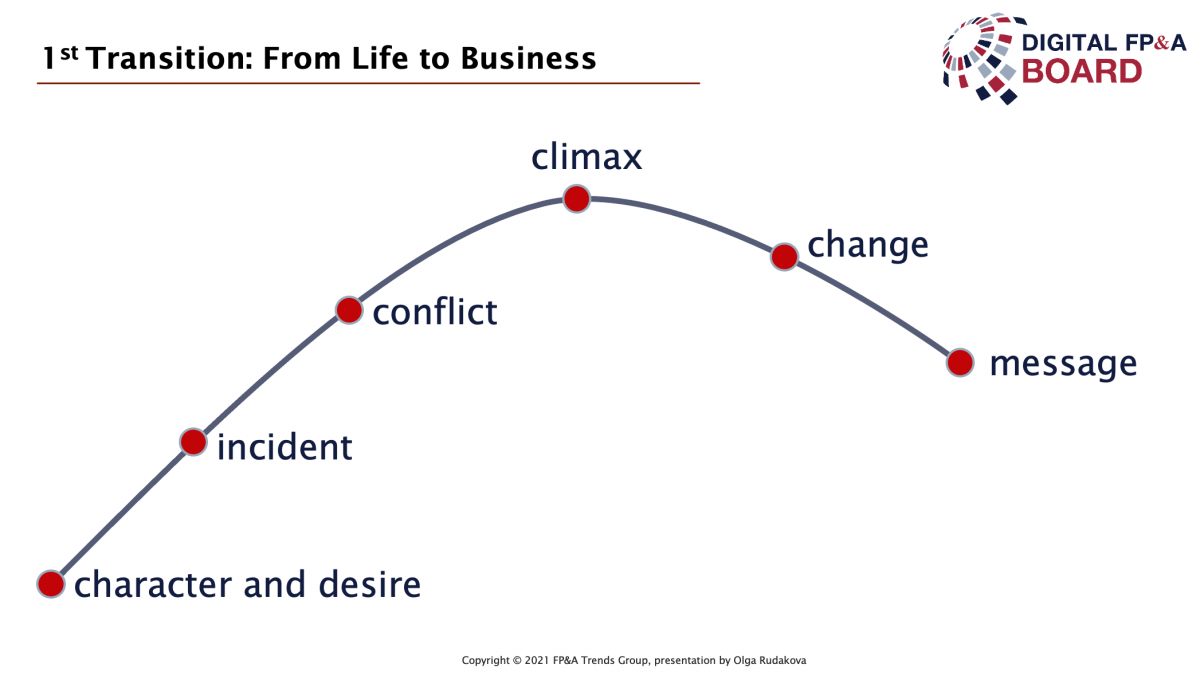
The first step you need to take on the path to visual storytelling in business is to consciously listen to yourself and others telling all sorts of stories. You will most likely notice this structure in every story you tell or hear (Figure 2). A story arc is a curve or plot line that can be found in any medium of storytelling: books, fairy tales, movies, and of course your story told to friends. Practice using the same structure when telling your business stories.

Figure 2
Start by introducing the main character and his/her desire. In business stories, it is not always a person. Your brand, product, business unit, the team of people can be the main character. And your typical business goals, such as growing sales, increasing market share, eliminating inefficiencies may serve as desires.
Bring in a catchy inciting incident, that significantly changes the main character's circumstances. Business or market change, new unforeseen obstacles or unexpected opportunities.
Make clear, what the conflict is. Will our business be able to overcome obstacles or seize opportunities?
Describe the climax. It is the most dramatic moment of the story and deserves to be told with extra detail and emotion. How do new circumstances affect our customers, partners or employees? How do they feel? What does this mean for our business performance?
Suggest a solution. Change in a story arc is usually your recommendation for the next action. That is how you want a story to continue. The beauty of business stories is that they are not finished yet, and how they end is up to us.
There is always a message at the end of the story. What are we learning? What are we taking away for better decisions in the future?
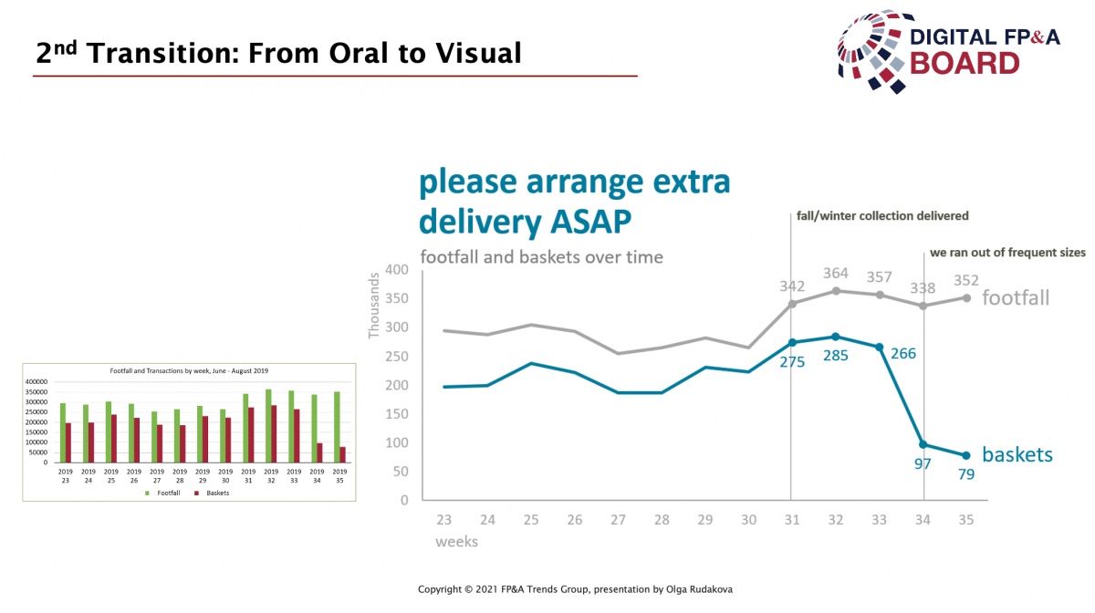
After you feel confident about telling business stories, it's time to take the second step. Move from an oral form to a visual form. It's tempting to just throw your data into a chart. But very often this leads to an unsatisfactory result, as in the small chart on the left (Figure 3).

Figure 3
If we want to get the chart on the right, we need to add a but science to it. There is no magic involved in visual storytelling, just science.
We need to learn how to:
declutter an image, i.e. remove all the unnecessary elements
apply Gestalt principles of visual perception and harness the full power of proximity, shape, orientation, and colour
focus our user's attention on what's really important by carefully adding preattentive attributes
add markers and labels only where you really need them
choose the chart title, narrative, and message to finish the picture
What do we get after all these steps are completed?
What is the result of FP&A Storytelling?
At the end, we get a single chart or series of charts, that convey financial insights to their viewers and enable data-driven decision making.
We might still want to present such charts to our audience, however as a part of an article, report or dashboard they will be pretty self-sufficient. Your charts and dashboards can and should tell their own stories.
Summary
We are all storytellers, that is why we can easily learn the principles of visual data storytelling. Just two simple steps separate us from the perfect chart, that tells its own story. Transfer of storytelling skill from life stories to business stories and shift from oral to the visual form of telling it.
Data Storytelling is a skill and like any other skill, it can be learned, through courses, self-study and more importantly through continuous practice. Good luck with that.
Subscribe to
FP&A Trends Digest

We will regularly update you on the latest trends and developments in FP&A. Take the opportunity to have articles written by finance thought leaders delivered directly to your inbox; watch compelling webinars; connect with like-minded professionals; and become a part of our global community.


