
By Randall Bolten, longtime Silicon Valley CFO, author of "Painting with Numbers: Presenting Financials and Other Numbers So People Will Understand You” and adjunct professor at U.C. Berkeley Extension.

In recent posts we’ve seen how tiny changes in the way we present numbers can have a huge impact on how well the information is understood. In this post, we look instead at how those little things can affect how your integrity or your ethics might be perceived.
For our example, consider a slide from an investor presentation I found online (click here for the original document). Just for the record, the company (Constant Contact – Nasdaq: CTCT) looks at first glance like a perfectly fine company; I’m only commenting on how they present some of their information. Here’s slide #13, showing the trend in Average Revenue Per User (ARPU):
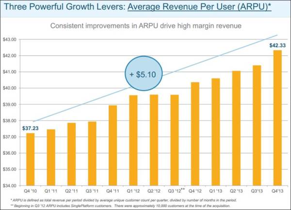
A quick glance at this graph suggests impressive growth – the height of the rightmost bar appears to be nearly triple that of the leftmost bar. But that appearance was created by truncating the vertical axis scale, so that $34.00 is at the bottom. Here’s what the graph would look like if the vertical axis scale began at $0.00:
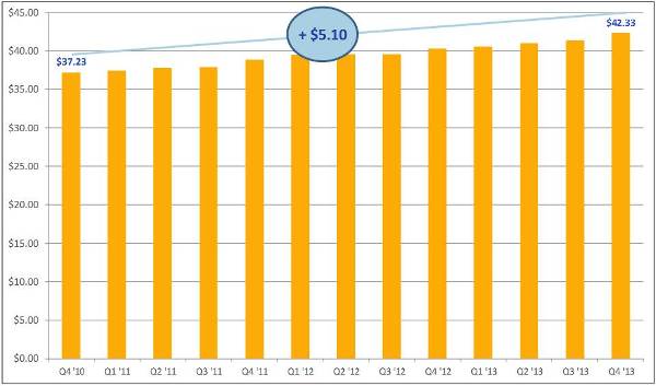
Not as visually impressive, is it? Raising the baseline of a graph is one of the oldest quantation tricks in the book; it features prominently in How to Lie with Statistics, the 1954 classic by Darrell Huff. So the question becomes: Was CTCT just making a naïve attempt to produce a more visually pleasing graph, or were they trying to make a trend look better than it really is? As far the audience is concerned:
- The most sophisticated consumers of quantitative information – that is, the ones whose good opinion is probably most critical – are most likely to draw the harshest conclusions about presenter intentions, and Those forming harsh conclusions are unlikely to share them with the presenter. The sad thing is that the $5.10, or 14%, improvement in ARPU over the time span shown really does seem impressive to me. CTCT asserts that ARPU is only one of several metrics affecting lifetime customer value, and the effect of each metric is multiplicative with the others. So if they all improved by 14%, that’s a big bump in total lifetime value. Moreover, the graph shows quarterly changes; the apparently modest growth rate of 1.1% per time period shown translates into 4.4% per year.
- The tactic of truncating a graph’s vertical axis is one we see all the time. But as you consider it, ask yourself: Is the potential benefit to how the content is interpreted worth the potential impact on how you are perceived as a presenter?
Stay tuned – we’re not quite finished with the CTCT investor presentation.
The next example from the CTCT presentation is the following pair of graphs, presented side-by-side on the same slide, showing paying customer additions. Note the main takeaways CTCT wants you to have, in the titles at the top of each graph. The color coding in the left-hand graph appears to be intended to enable you to make year-over-year comparisons of the four quarters of 2013 versus 2012:
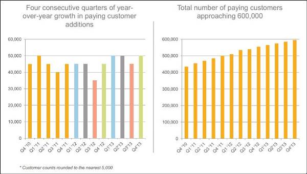
Now look more closely. The left-hand graph does not show customer additions in each quarter – every value in that graph is 35,000 or higher, and every quarter-to-quarter change in total number of paying customers shown in the right-hand graph appears to be less than 25,000. Perhaps the left-hand graph is some measure of year-over-year change, but even if that’s the case, the left-hand and right-hand graphs do not tie to each other in any way that I have been able to figure out. (Perhaps labeling the axes might have helped.)
Also, note the comment below the left-hand graph: “Customer counts rounded to the nearest 5,000.” I can’t think of a valid, honest reason why CTCT would choose to round a bunch of numbers – none higher than about 50,000 – to the nearest 5,000, when it’s obvious that they have the exact numbers of new customers at their fingertips.
Lastly, note the heading above the left-hand graph – “Four consecutive quarters of year-over-year growth. . .” This statement could be the equivalent of saying, “One consecutive year of year-over-year growth.” That just doesn’t seem impressive. Why are they bothering?
Here’s the overall problem: Rather than simply giving investors the raw data – and letting the investors calculate their own derivative metrics – CTCT has chosen to cherry-pick its metrics, present the information imprecisely (i.e., rounded on the left and hard to read accurately on the right) and in a way that the reader can’t get back to the raw numbers, and put a hard-to-validate spin on the results. Even if CTCT’s reasons are completely innocent, their approach is guaranteed to provoke suspicion in the minds of some.
Again I ask: Is the potential benefit of spinning your information worth the potential impact on how you are perceived as a presenter?
Let's look at one last example from the CTCT presentation. But this time, we look at what's omitted.
In several places in the presentation, CTCT alludes to its past and potential profitability. Here’s an example:
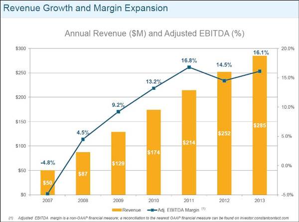
CTCT presents “Adjusted EBITDA” and “Free Cash Flow” in several places in the presentation, but nowhere do they present Operating Income, Net Income, EPS or any other GAAP- standard profitability metrics. They do include the following footnote:
“Adjusted EBITDA margin is a non-GAAP financial measure; a reconciliation to the nearest GAAP financial measure can be found on investor.constantcontact.com.”
Put another way, “If you want to see the corresponding GAAP numbers, you’ll have to work for it.”
Both EBITDA and Free Cash Flow are metrics that look “better” than their closest GAAP equivalents because they are calculated by adding back certain expenses and expenditures. For that reason, even if CTCT asserts that these are the most appropriate and valid metrics – a highly arguable assertion, but let’s leave that aside for now – presenting those metrics to the complete exclusion of their GAAP equivalents is certain to raise questions in the minds of some in the audience – questions like, “Why don’t they want us to look at the GAAP numbers?” “Are they hiding something?”
Again I ask: Is the potential benefit of spinning your information worth the potential impact on how you are perceived as a presenter? Only this time, the spinning doesn’t lie in what you do present, but in what you don’t present.
As we leave this subject, let’s last consider the frequency of these perhaps unfortunate presentation choices. One such choice is probably innocent or at least not worth focusing on, but three is more likely to make us question the presenter’s intentions.
[We’ll also leave aside for now the facts that “Adjusted” EBITDA (%) isn’t defined and that they don’t state what it’s a percentage of, as well as the question of whether showing these two metrics on the same graph, with two vertical axes, is a valid and appropriate way to present this information. Perhaps some other time. . .]
Subscribe to
FP&A Trends Digest
We will regularly update you on the latest trends and developments in FP&A. Take the opportunity to have articles written by finance thought leaders delivered directly to your inbox; watch compelling webinars; connect with like-minded professionals; and become a part of our global community.