
By Randall Bolten, longtime Silicon Valley CFO, author of "Painting with Numbers: Presenting Financials and Other Numbers So People Will Understand You” and adjunct professor at U.C. Berkeley Extension.

 Of the four essential questions every effective FP&A professional should ask before presenting graphical information, the first three focused on making the information understood. The fourth, and last, question you should ask yourself is different:
Is there anything about your graph that might cause your audience to question your agenda or even your honesty?
This is a much bigger problem with graphs that it is with tables. However, creating the wrong effect – even unintentionally – with your graphs can cause you enormous professional harm.
The best and most obvious example of this issue relates to scaling your axes. Here’s a simple graph, showing the Vaporware and Software Technologies Corporation’s operating profit over a 5-year period:
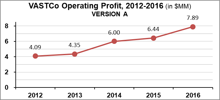
VASTCo has done well, nearly doubling its profit over four years. Now, here’s Version B of the same graph, with some “slight” changes to the vertical axis scale:
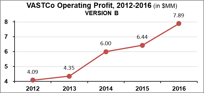
Wow! Now it looks like VASTCo’s profits are really going through the roof.
And just to show you how a graph can create the opposite effect, here’s Version C, perhaps based on the presumption that when measuring profit, you could end up presenting negative numbers:
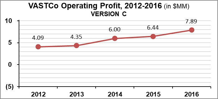
Given these three examples – which create wildly different visual impressions – what is the right way to present this information? Some in your audience won’t care, but others will consider Version B, or perhaps even Version C, as a deliberate attempt to manipulate. And you’ll have no idea who in your audience will form that conclusion. So be safe: When in doubt, if the variable you’re graphing has a “natural zero,” start your axis scale at ZERO, even if the graph wizard defaults to different scaling.
But there’s more to this than just scaling your axes. The next few infographics come from a single investor relations presentation I found online. The first one presents “average revenue per user,” a key revenue-driving metric for this company:
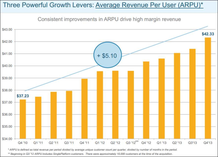
Just as we discussed above, note that the vertical axis scale starts at $34.00 – so visually, the 15% increase over the thirteen quarters looks pretty impressive. Now here’s my version of the same graph, with the scale starting at zero:
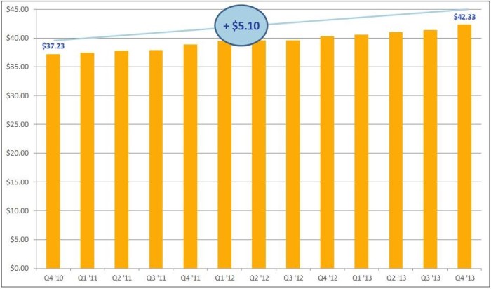
Need I say more?
A couple of slides later, I encountered this slide (the red artwork is my own):
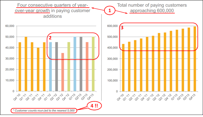
My comments below are keyed to the red numbers above:
- “Four consecutive quarters of year-over-year growth” sounds impressive at first, but think about it… aren’t they merely saying, “One consecutive year of year-over year growth”? And customers “approaching 600,000” certainly uses a number with a lot of zeroes, but is it impressive? Compared to what? This seems to be a highly selective presentation of data, sometimes known as cherry-picking, and can be fatal to any FP&A professional’s reputation for candor and integrity.
- What is the point of the color scheme? Perhaps it’s intended to distinguish quarters, but if so, why not apply that color scheme to the first five quarters shown? Is this more cherry-picking?
- As I look at the right-hand graph, I’d really like to know if the new customer growth rate is increasing or decreasing. It’s hard to tell, but I’m guessing from the slightly concave shape of the graph (place a straight-edge along the graph to verify this), that it’s decreasing. This is an inherent weakness of graphs: the reader often can’t perceive the precision he/she is looking for.
- I find this decision utterly baffling. Why round numbers, the largest of which is about only 50,000, to the nearest 5,000? Presentation choices like this make me question the presenter’s agenda.
Finally, one more slide in the presentation deck caught my attention:
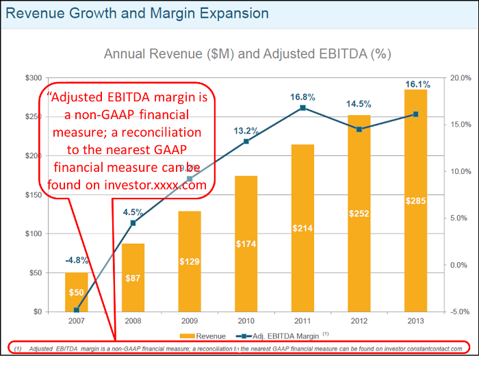
Why are these two metrics presented on the same graph? Are they trying to show some sort of correlation? Moreover, EBITDA % is flat or down over the final three years, while revenues continued to grow. I was also struck by the footnote in tiny print at the bottom, which I have expanded, in the red type balloon, for the optically challenged. This company is clearly shying away from GAAP (i.e., “generally accepted accounting principles”) numbers – in fact, the entire 26-slide presentation has almost no GAAP numbers other than reported revenue. I’ll grant that financial statements strictly in conformance with GAAP – or with IFRS, for that matter – frequently fall short of perfect clarity, but too much reliance on pro forma financials can create the same kind of suspicion I’ve been talking about.
On another note, this slide shows the inherent problem with graphs that have two vertical axes. Not only are they hard to read, but unless you’re very careful with the axis scaling, you’re giving your audience yet another opportunity to question your intentions.
Frankly, I have no idea whether this company was trying mislead or obfuscate about their financial condition, or whether these slides were prepared by honest and well-meaning, but busy FP&A professionals who simply weren’t paying much attention to how their slides might be perceived. Regardless, by the time I got to the end of this company’s presentation, I was annoyed. And suspicious.
Why is it that graphs are so much more likely than tables are to provoking audience suspicion about your agenda? First of all, the whole point of a graph is usually to emphasis a single, critical point you’re trying to make. Your audience may be acutely aware that you’re in “persuade” mode, so be careful about appearing to oversimplify a complex problem or cherry-pick your data. Second, graphs offer an immense range of choices, including axis scaling, chart types, color and other visual effects, and much more. Each one of those many choices can send its own meaning to your audience.
So be careful out there!
The article was first published in prevero Blog

Subscribe to
FP&A Trends Digest
We will regularly update you on the latest trends and developments in FP&A. Take the opportunity to have articles written by finance thought leaders delivered directly to your inbox; watch compelling webinars; connect with like-minded professionals; and become a part of our global community.